Rethinking the checkout experience for a new generation of retailers
Client
Tactill
Duration
Ongoing
Role
Design Lead
Year
2022
When I joined Tactill a little over three years ago, I came in as part of a small yet ambitious product team. We were building a point-of-sale app for iPad alongside a web-based dashboard for business owners. Two platforms, one design team, and a whole lot of inconsistencies starting to pile up.
At first, I worked under the direction of Ugo Joffrey, a designer with deep expertise in UX, Figma, and design systems. Under his lead, we laid the groundwork for what would become a robust system. When he moved on, I picked up the torch and scaled it further.
POS App
The challenge
When we embarked on the redesign of Tactill version 5, the challenge was clear: create a fluid, robust user experience adapted to increasingly varied customer profiles. The application consists of two pillars: the cash register, used directly in the store, and the dashboard, a web-based backoffice that centralizes all management operations, from catalog to sales statistics. The two are complementary and equally important in functional terms. But it’s the cash register that is the gateway to the solution. It’s the first interface that users download, test and use. It’s also where the transformation into a paying customer takes place. It had to be ultra-clear, effective right from the outset, and capable of convincing users on its own of the value of the entire ecosystem.
Building on what already exists
This version 5 doesn’t come from nowhere: V4 is still used by many customers. So we started with a solid history of use and a valuable feedback base. We also carried out an in-depth comparative analysis of the other cash registers on the market, to identify the unavoidable standards… but also the opportunities to do better. Our aim: to maintain the expected fundamentals, while unlocking new, richer, more flexible use cases - in particular to support Tactill’s rise to prominence in the catering and multi-store markets.
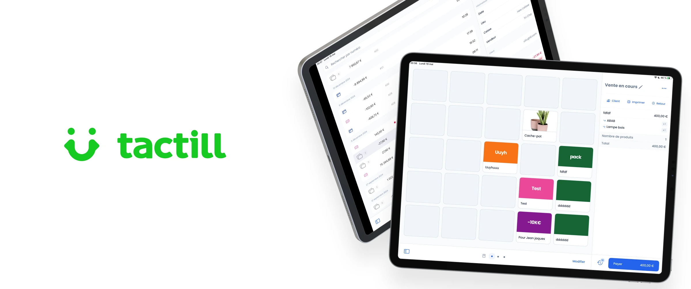
An interface designed for efficiency
The main screen features a simple, easy-to-read split screen: on the left, the product catalog with a search bar and configurable grids; on the right, the sales receipt. It’s intuitive and quick to learn. Customizable grids allow you to recreate visual shortcuts adapted to your best-selling products, because not everyone sells everything, and certainly not with the same frequency. Entry is straightforward: just tap on a product to add it to the ticket. You can split lines, apply individual discounts, cancel or put a sale on hold - a key feature, especially for instalment payments.
A unique innovation on the market: payment flexibility
Identifying the Pain Points
In earlier versions of our app the payment screen followed a rigid model: one ticket, one total, one payment. While this structure works for straightforward retail transactions, it falls short in more complex contexts like food service or shared payments, where flexibility is essential.
We identified two key sources of friction during user interviews and field observations:
“We can’t split a bill properly”
Restaurants and other hospitality businesses frequently need to split bills between multiple customers. Existing systems rarely support this without cumbersome workarounds such as manual ticket duplication, calculator apps, or even paper notes. These methods introduce delays, increase the risk of error, and frustrate both staff and customers.
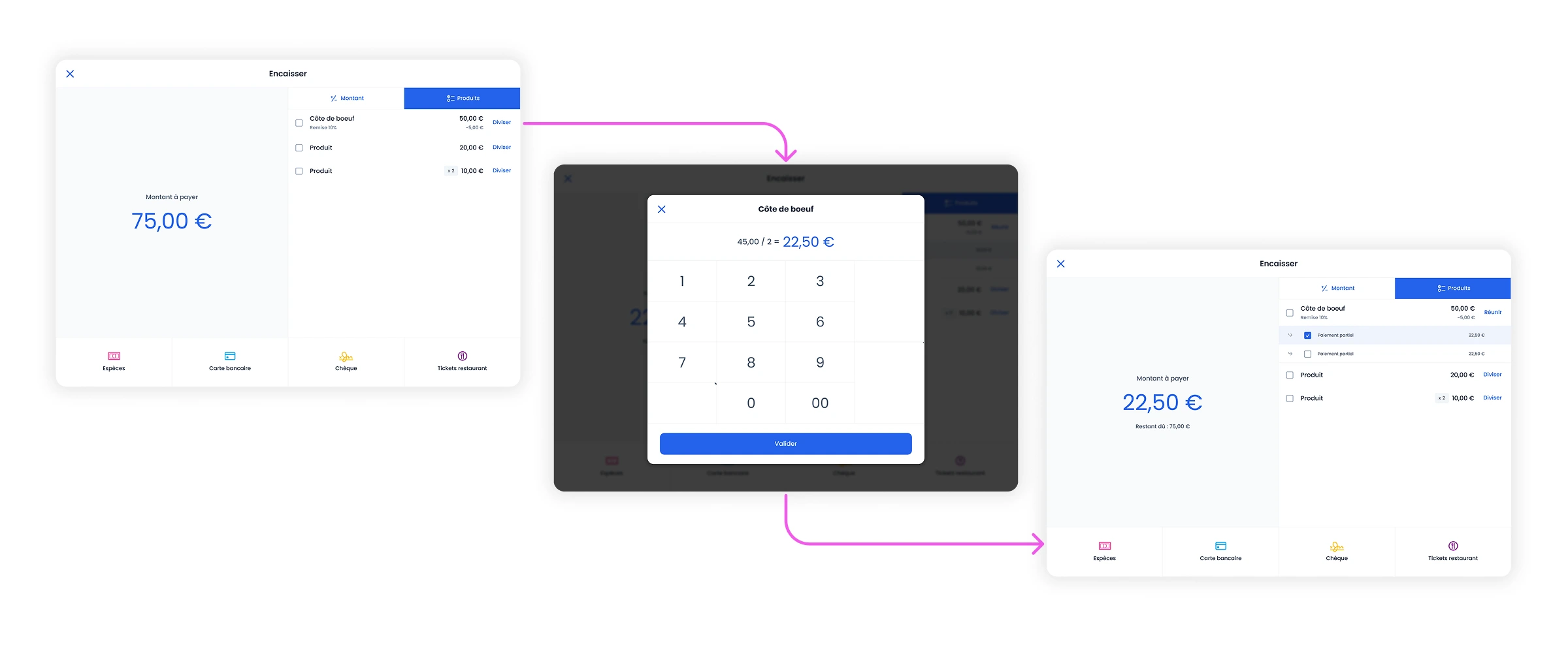
We introduced a new “product-based” payment mode, designed specifically for these complex scenarios. This mode allows the operator to:
- Select specific items from a ticket for payment
- Split individual lines (e.g., one of two identical dishes)
- Process partial payments
- Combine payment methods on a single ticket
After prototyping in Figma and validating the interaction model internally, we developed and tested the feature in production under controlled conditions. Special attention was given to edge cases such as rounding, multi-method payments, and real-time ticket updates. Early adopter feedback was clear: the feature is intuitive and meets a real operational need, particularly in fast-paced hospitality environments.
“I just want to take payments quickly, without extra steps”
For retail stores, speed and simplicity are paramount. Staff often want to enter a total amount, select the payment method, and complete the sale in seconds. Complex UI flows built for other use cases become a source of confusion and slowdowns in this context.
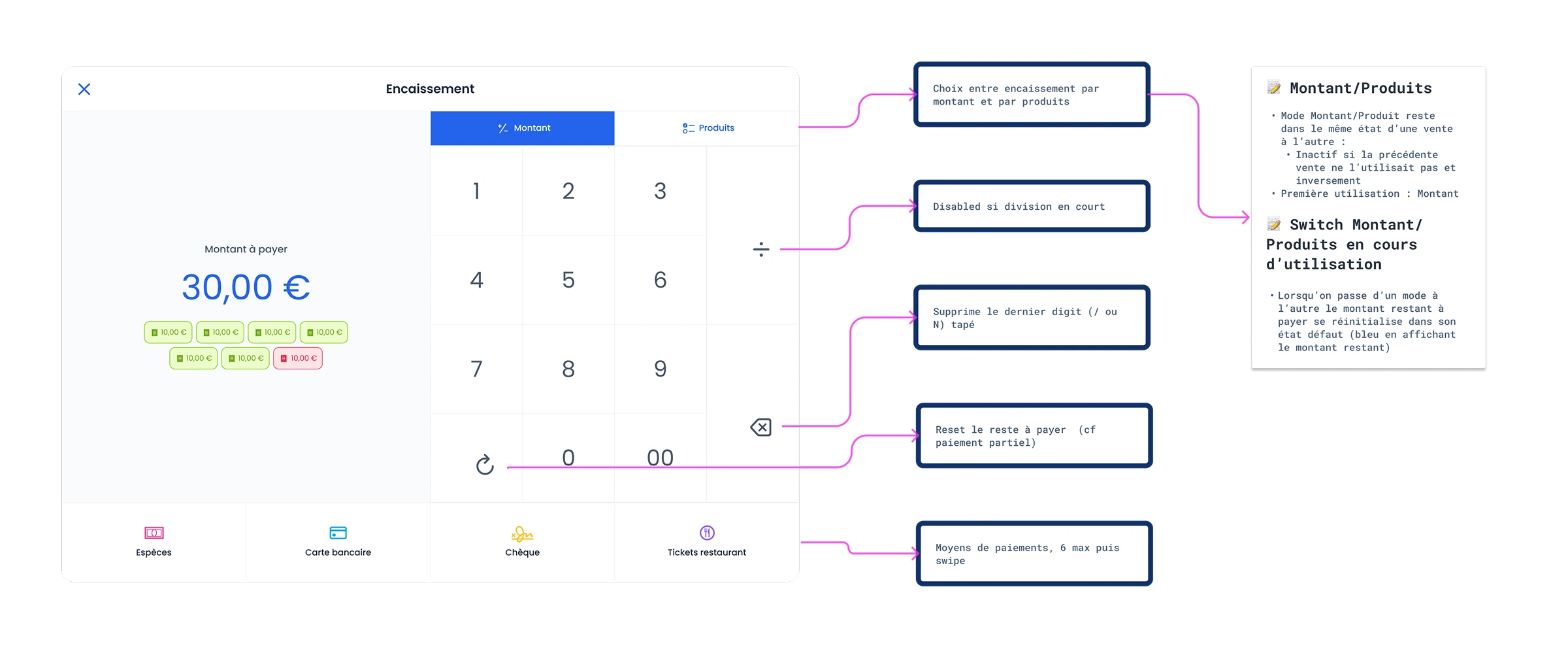
We retained a “amount-based” payment mode optimized for simplicity and speed:
- Staff can enter the amount to be collected directly
- The interface calculates and displays change when needed
- The process completes in a single, clear flow
Field testing in boutiques confirmed that the new interface reduced error rates and improved checkout times, without compromising on clarity.
A Smarter, More Adaptive Checkout Experience
By introducing two complementary payment modes—amount-based and product-based, we’ve created a system that adapts to varied business models instead of forcing them into a single structure.
- In retail, the emphasis is on speed, simplicity, and minimal error.
- In hospitality and group-use contexts, the emphasis is on control, flexibility, and shared responsibility.
Crucially, each mode has been designed to feel native to its context, without burdening users with unnecessary complexity when it isn’t needed.
This balance is what sets our payment flow apart from the rest of the market.
What this phase helped transform
By rethinking the checkout in this way, we laid the foundations for a fluid, modular and, above all, adaptable user experience. The POS becomes a unique tool on the market, capable of covering simple to highly advanced uses, without compromising on efficiency. It also embodies Tactill’s new ambition: to address more complex, more demanding customers, without losing the simplicity that has made previous versions so successful.
Web Dashboard
A Design Grounded in Real Usage
As a continuation of work engaged on the iOS point-of-sale app, this second phase focused on a complete overhaul of the web admin space. A key strategic decision was to maintain strong visual and functional consistency across both platforms while embracing interface logics suited to each use case.
Why? Because 75% of V4 users never accessed the dashboard from a desktop and some didn’t even own one. Their primary access point was the iPad itself which drove a clear direction: a in-depth web app with a familiar design, inspired by iOS complete with sidebar navigation, modular views, and fluid interactions across entities (sales, payments, catalog…).
A Back Office Reimagined for Multi-Store Growth
With V5, Tactill evolved from a single-store model** to a full multi-account / multi-store architecture This structural shift had a strong impact on UX/UI needs.
The dashboard was enhanced with new statistical views by store quick filters by period, category analysis, stock valuation… all while keeping a clean, modular approach that stays easy to read.
The design system remained the unifying logic: navigation, tab organization, and data logic are shared with the iOS app, ensuring seamless continuity across contexts.
Focus: Inventory Movement Management
One of the major additions in this version was the creation of a true stock management system designed as a central tool for multi-store users.
This feature did not exist at all in V4 and was built from scratchfollowing a full user research cycle:
- 3 phone interviews
- 1 in-depth video call (>90 min)
- 4 responses to a long-form survey
- Synthesis assisted by AI + product scoping with tech teams
This research phase allowed us to prioritize needs match real-world usage with technical feasibility, and define an MVP scope tested in early beta.
User Needs Summary: Inventory Management
Here are the key features identified, prioritized by impact and feasibility and integrated into the roadmap:
| Priority | Feature | Description |
|---|---|---|
| ↑↑↑ | Toggleable stock tracking | Allows negative stock for pre-orders and early sales |
| ↑↑↑ | Real-time stock per location | View stock levels by store in real time |
| ↑↑↑ | Simplified stock transfers | Easy transfers between stores with full traceability |
| ↑↑↑ | Low stock alerts | Automatic notifications to avoid stockouts |
| ↑↑↑ | Stock movement exports | Clear, filterable exports by store, date, type |
| ↑↑↑ | Excel import support | Quick upload of existing inventory or supplier orders |
| ↑↑ | Inventory mode with scanner support | Physical inventory with barcode scanners or Bluetooth readers |
| ↑↑ | Purchase price history | Track price changes over time per product |
| ↑↑ | Real-time margin calculation | Instant visibility into gross margin per item |
| ↑↑ | Product reservation | Temporarily removes product from available stock |
| ↑↑ | Hide product from POS | For unsellable or upcoming items, or when out of stock |
| ↑↑ | Loss/Damage stock tracking | Monitor shrinkage rates per product/store |
| ↑ | Customer restock notifications | Notify buyers when sold-out items are back |
| ↑ | Online store integration | Sync stock levels with an e-commerce platform |
| ↑ | Dedicated stock management app | Potential standalone app for advanced inventory flows |
An Experience Built for Power Users
The inventory movement interface was designed as a dedicated, full-screen module, deliberately separated from the standard dashboard views to allow maximum focus and streamlined task completion. Drawing inspiration from iOS modal flows, the experience is dense but controlled, tailored for tablet and desktop contexts alike.
Key Flows Implemented in the MVP
- Simplify transfers between boutiques
- Integrate stock loss/damaged tracking
- Real-time stock per location
- Low stock alerts
- Simplified stock transfers
- Track purchase price history
- Enable real-time margin calculation
- Extract stock movements
- Future support for "Low stock alerts"
- Excel import support
- Extract inventory files by location
Outcome: A Robust Foundation, Validated in the Field
The MVP was launched in controlled beta with ~50 users, prioritizing multi-store operations. This allowed us to:
- Validate core flows (incoming, outgoing, transfer)
- Test cross-device behavior (desktop and iPad)
- Confirm demand for real-time visibility and exports
Not all user requests were addressed in this phase, but the system is built to scale.
This first version delivers a solid, modular stock management system aligned with real operational needs, unlocking reliable stock tracking, powerful multi-store handling as well as extensibility for further inventory management implementation.
Design system
Why We Built It
Like many growing teams, we were repeating ourselves: duplicating components, renaming the same things differently, and struggling to sync design with dev. We needed a design system that would help us to make better decisions, faster, reduce ambiguity, and keep our focus on real product problems.
We didn’t just want reusable components. We wanted:
- A shared visual and semantic language
- A smoother design-to-dev handoff
- A system flexible enough for iOS and web, but realistic for a small team to maintain
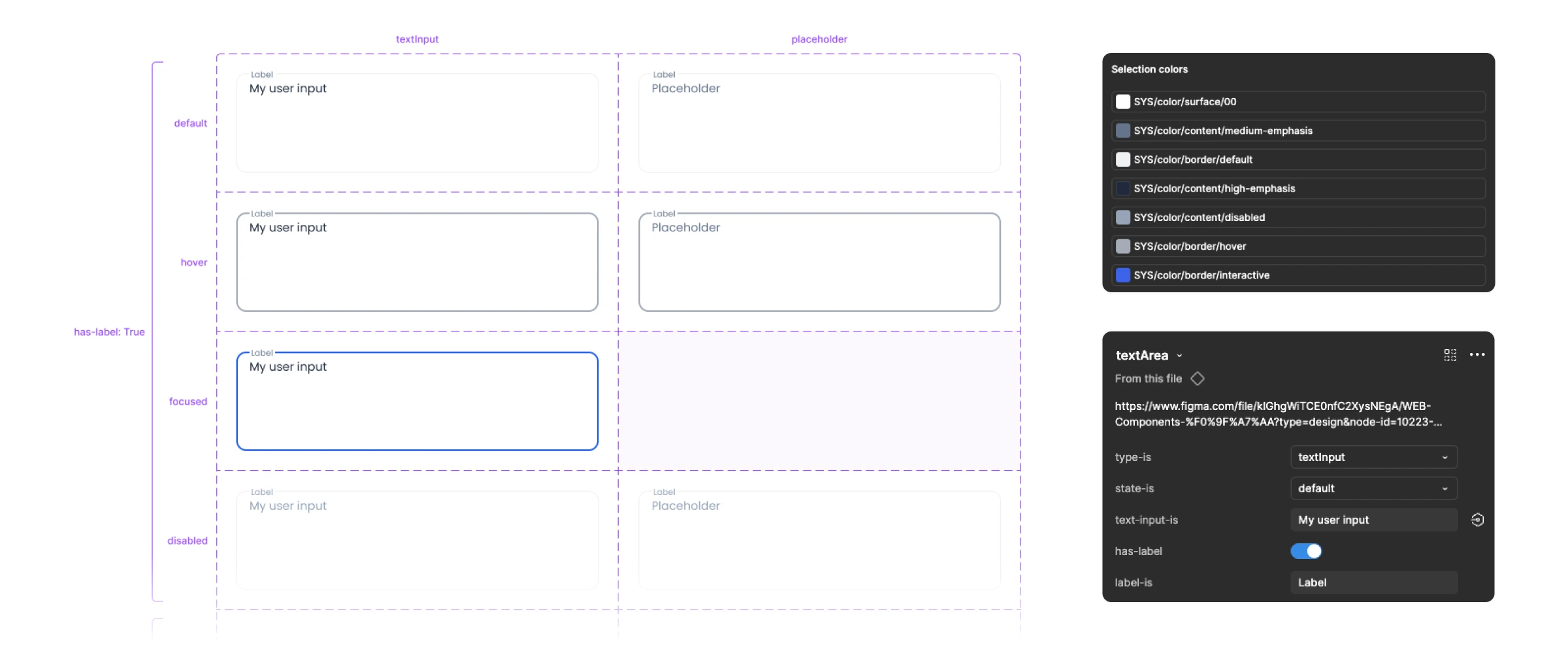
Atomic Design + Semantic Tokens
We started with the atomic design model: atoms, molecules, organisms, templates.
On top of that, we implemented a three-layer token system, though we chose to use only the first two layers in practice:
- ref/ tokens: raw values (like colors, radii, spacing). These are context-free: just the primitives.
- sys/ tokens: contextual meaning (like color.status.success or radius.card.default). This is where semantics come in.
- comp/ tokens: component-specific tokens (like comp/alert/info/background). We tested this level, but it added too much overhead for our team size so we parked it for now.
The result: consistency, flexibility, and a naming system that worked for both designers and developers.
Tailored by Platform
Early on, we tried to merge iPad and web components into one unified system. The idea was to avoid duplication and streamline updates. In reality, it just didn’t work.
iOS development comes with specific constraints: layout patterns, native components, interaction models. Trying to force alignment with the web version slowed us down and created more edge cases than it solved.
So we made the call to split the design systems, while keeping shared foundations (tokens, naming, principles). It gave us room to respect each platform’s needs without compromising clarity.
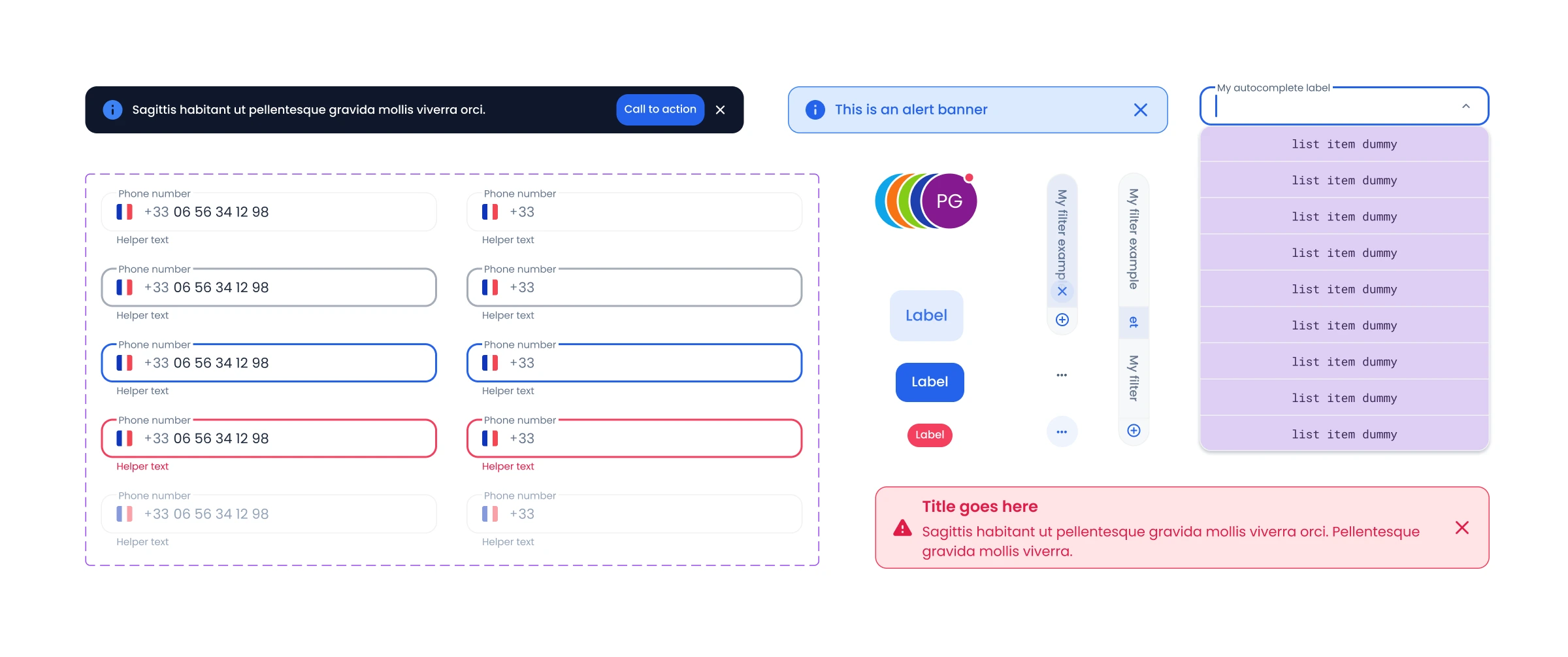
Figma: Structured, Systematic, and Scalable
Figma became our central hub and we pushed it to its full potential.
- Tokens were embedded using Figma’s Variables system
- Tokens were scoped by type: color, spacing, typography, border radius and applied with discipline (no mix-ups allowed)
- Components were built with Properties, following strict naming conventions
- Variants handled states, shapes, icons, etc.
- Icons: FontAwesome for web, SF Symbols for iOS to keep things consistent and native
We also relied on Figma’s Properties Table (auto-generated) and an Instance Table plugin, which made it dead simple for anyone to explore all variations of a component at a glance.
Designers could work faster, and new team members could onboard in days.
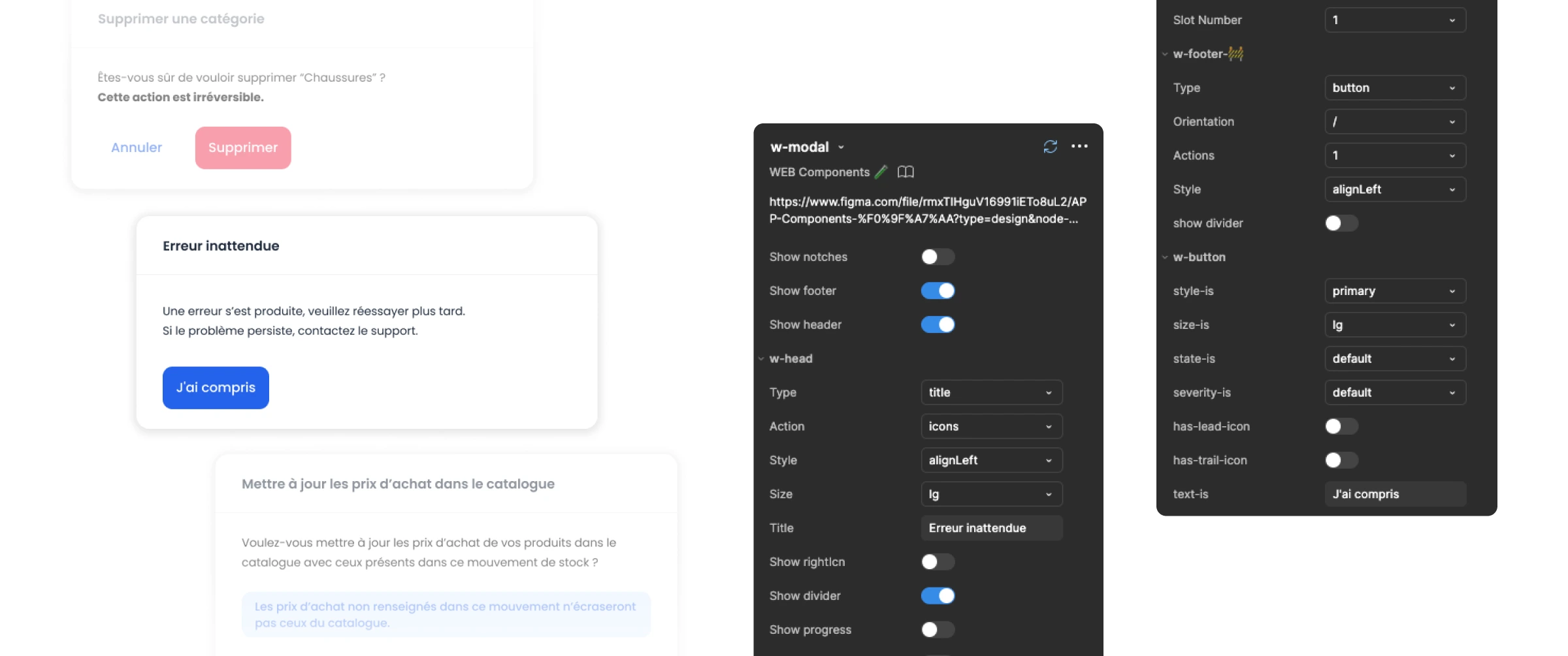
Developer Handoff: Storybook and No Surprises
Good design is useless if the handoff breaks down.
That’s why we coupled our Figma system with a Storybook instance that mirrored our component structure. For each element, devs could:
- View all states and variants live
- Match what they saw in Figma
- Integrate components one step at a time
This made collaboration smooth, reduced back-and-forth, and ensured that what was designed is exactly what got built.
Thanks to the token integration, Storybook components inherited the same values as Figma so, no translations, no guessing.
What Worked and Why It Mattered
This wasn’t just a “design cleanup” project. It was a shift in how we work as a team.
We moved from scattered files and manual tweaks to a systemized, flexible, and documented approach. The design system helped us:
- Move faster without sacrificing quality
- Stay aligned across design and dev
- Document everything so the team could evolve with or without me
- Handle two platforms with one consistent mindset
It impacted every aspect of our work, from initial sketches to final handoff. And it paid off in spades.
Thanks for reading! If you have any questions or feedback, please don’t hesitate to reach out.